
What Makes a Colour Feel Timeless?
There are colours that immediately place a home in a particular moment and others that seem untouched by time entirely. The difference is rarely about whether a shade is technically “on trend.” More often, it comes down to something quieter: balance, restraint, and the way a colour lives within a space over time.
In interior design, colour is one of the most emotional decisions a client makes. It shapes atmosphere before furniture is arranged or lighting is installed. It influences how a home feels to wake up in, to entertain in, and to return to at the end of the day. Yet despite its importance, colour is often approached in isolation, chosen from a sample card rather than considered as part of a wider experience.
Timeless colour is rarely accidental.
Timeless Doesn’t Mean Safe
There is a common misconception that timeless interiors must be entirely neutral. In reality, some of the most enduring homes use colour beautifully, but thoughtfully.
A timeless palette is less about avoiding colour and more about understanding tone. Soft olive, chalky plaster pinks, warm stone, deep aubergine, muted ochre, smoke blue, these shades tend to endure because they contain complexity. They shift subtly throughout the day and sit comfortably alongside natural materials.
What dates quickly is often anything too absolute: colours that feel overly bright, overly cool, or chosen without connection to the architecture of the home itself.
The most sophisticated interiors tend to avoid extremes. Instead, they rely on depth, nuance, and tonal harmony.
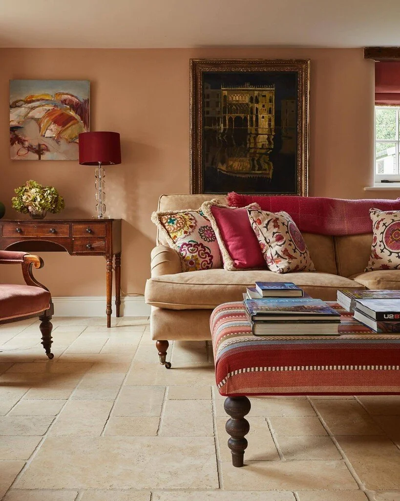
Photo credit - Farrow & Ball
Our Top Timeless Paint Options:
Farrow & Ball - Slipper Satin
A soft off-white with warmth and gentleness. Feels calm rather than stark, making it incredibly liveable across different light conditions.
Farrow & Ball - Hay
Soft and understated rather than bright, it has an earthy, sun-baked quality that works beautifully in spaces where you want warmth and light without anything too overpowering. Depending on the light, it can feel gently golden, relaxed and slightly rustic.
Farrow & Ball - Hague Blue
A deep blue with richness and maturity. An example of how darker colours can still feel timeless when used thoughtfully.
Benjamin Moore - Saybrook Sage HC-114
A muted sage green that feels grounded and architectural. A timeless alternative to trend-driven greens.
Benjamin Moore - Hush AF-95
A muted mauve-taupe that creates warmth and intimacy very subtly. An excellent example of colour being felt before noticed.
Little Greene Paint Company - Rolling Fog
A beautifully soft greige with warmth and depth. Understated and incredibly adaptable across different interiors.
Little Greene Paint Company - Olive Colour
A muted olive green with richness and maturity. Feels historic, grounded, and enduring.
Little Greene Paint Company - Nether Red
A deep earthy red-brown that brings warmth and atmosphere without feeling trend-led.

The Role of Light
Colour never exists on its own.
Natural light changes everything, softening certain shades, intensifying others, and revealing undertones that may not appear obvious at first glance. A colour that feels calm in a south-facing room may feel flat in a darker space. Equally, a deeper tone can bring unexpected warmth and intimacy where lighter colours fall cold.
This is often why choosing paint from a small swatch can feel surprisingly overwhelming. Colour is experienced spatially. It reacts to architecture, texture, shadow, and season.
A timeless palette considers all of these elements together rather than focusing on colour in isolation.
Why Restraint Often Feels More Luxurious
Some of the most memorable homes are not necessarily the boldest. They are the ones that feel composed.
Restrained palettes create a sense of ease because they allow materials, craftsmanship, proportion, and light to speak more clearly. Rather than demanding attention immediately, they reveal themselves gradually over time.
This doesn’t mean every room should feel the same. Contrast remains important. But in well-considered homes, contrast is usually introduced with intention, through texture, artwork, joinery, lighting, or a single unexpected moment of colour, rather than competing statements in every room.
There is confidence in subtlety.
Designing for Longevity
One of the questions clients often ask is whether they will still love a colour years from now.
The truth is that timeless interiors are rarely designed around a single moment or trend. Instead, they are built around atmosphere: how a home should feel both now and in the years ahead.
A considered palette allows a home to evolve naturally. Furniture can change, art can move, and styling can shift seasonally, yet the foundation remains calm and coherent.
That sense of longevity is often what makes a home feel truly luxurious. Not because it resists change entirely, but because it was never designed to chase it.
Final Thoughts
The colours that endure are usually the ones that feel connected, to the architecture, the light, the materials, and ultimately the people living within the space.
Timeless colour is less about following rules and more about creating quiet consistency throughout a home. When done well, it is rarely the first thing people notice.
It is simply what makes the space feel right.
