
Cosy Colour Combinations for Autumn Interiors
As the light changes and evenings begin to draw in, autumn naturally shifts the way we experience our homes.
We start to crave deeper tones, softer textures and rooms that feel warm and inviting. But creating a cosy interior doesn't necessarily mean reaching for traditional autumnal colours or covering a room in rich, dark shades.
The most sophisticated autumn interiors are often more nuanced.
Think warm browns alongside softened neutrals. Muted reds balanced with gentle pinks. Deep greens paired with earthy tones. Colours that feel connected rather than perfectly matched.
For us, the key to creating a cosy home is not simply choosing warm colours. It's about understanding how different tones work together, how they respond to natural light, and how they can create atmosphere without feeling overly themed. Here are some of our favourite colour combinations for creating a warm and inviting home this autumn.
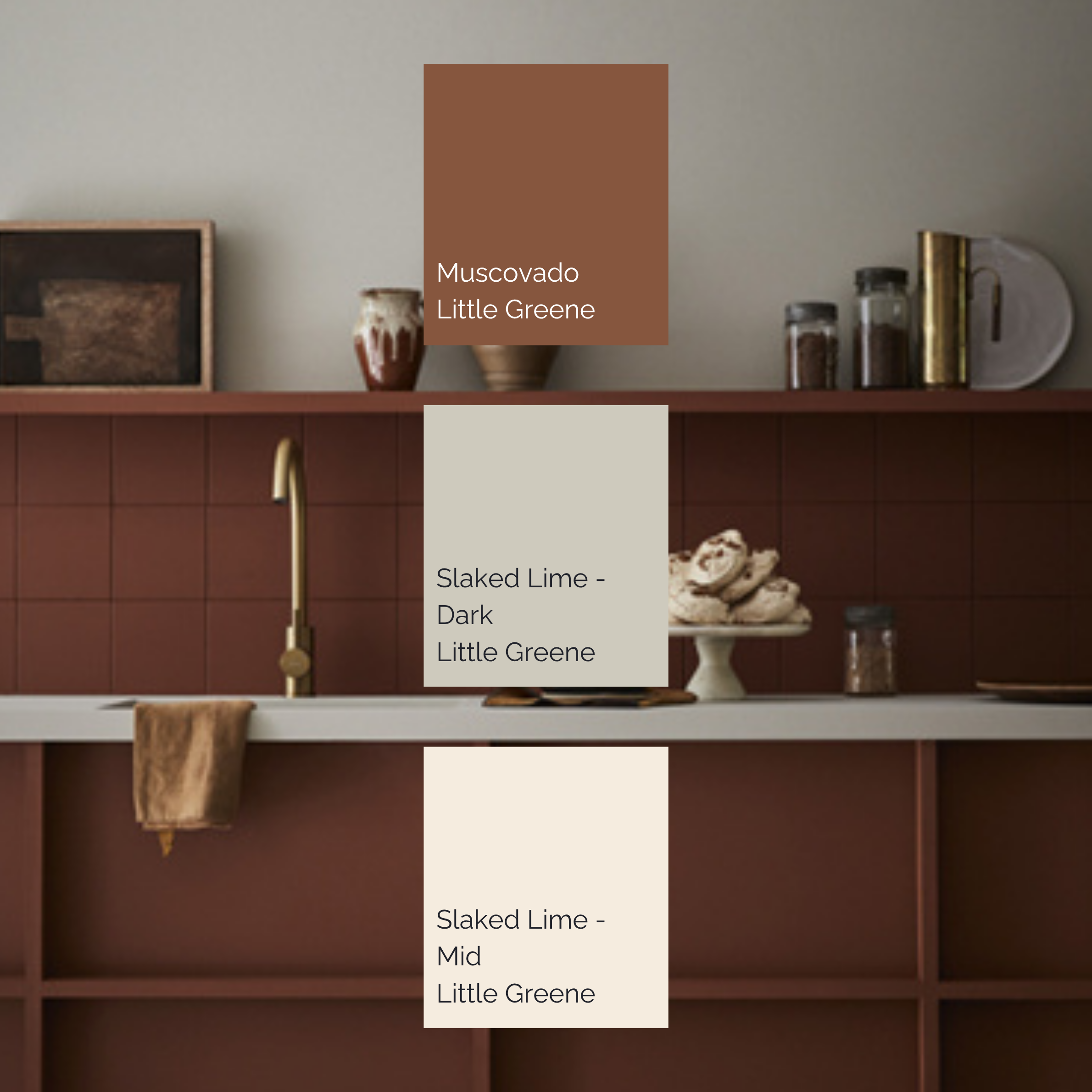
Photo credit - Little Greene
Rich brown & soft warm white
Muscovado by Little Greene
Slaked Lime – Dark by Little Greene
Slaked Lime – Mid by Little Greene
Brown is having something of a renaissance in interiors, and for good reason.
Deep, earthy browns can create an immediate sense of warmth and intimacy, particularly in rooms where you want to encourage people to settle in and stay awhile. In the example above, Muscovado is balanced with the softer tones of Slaked Lime. Rather than creating a high-contrast scheme, the colours sit comfortably alongside one another, allowing the darker tone to feel rich rather than heavy.
This kind of palette works particularly well in kitchens, dining rooms, studies and snug spaces. The important detail is balance. Allow the deeper colour to provide depth, while the lighter neutral gives the eye somewhere to rest.
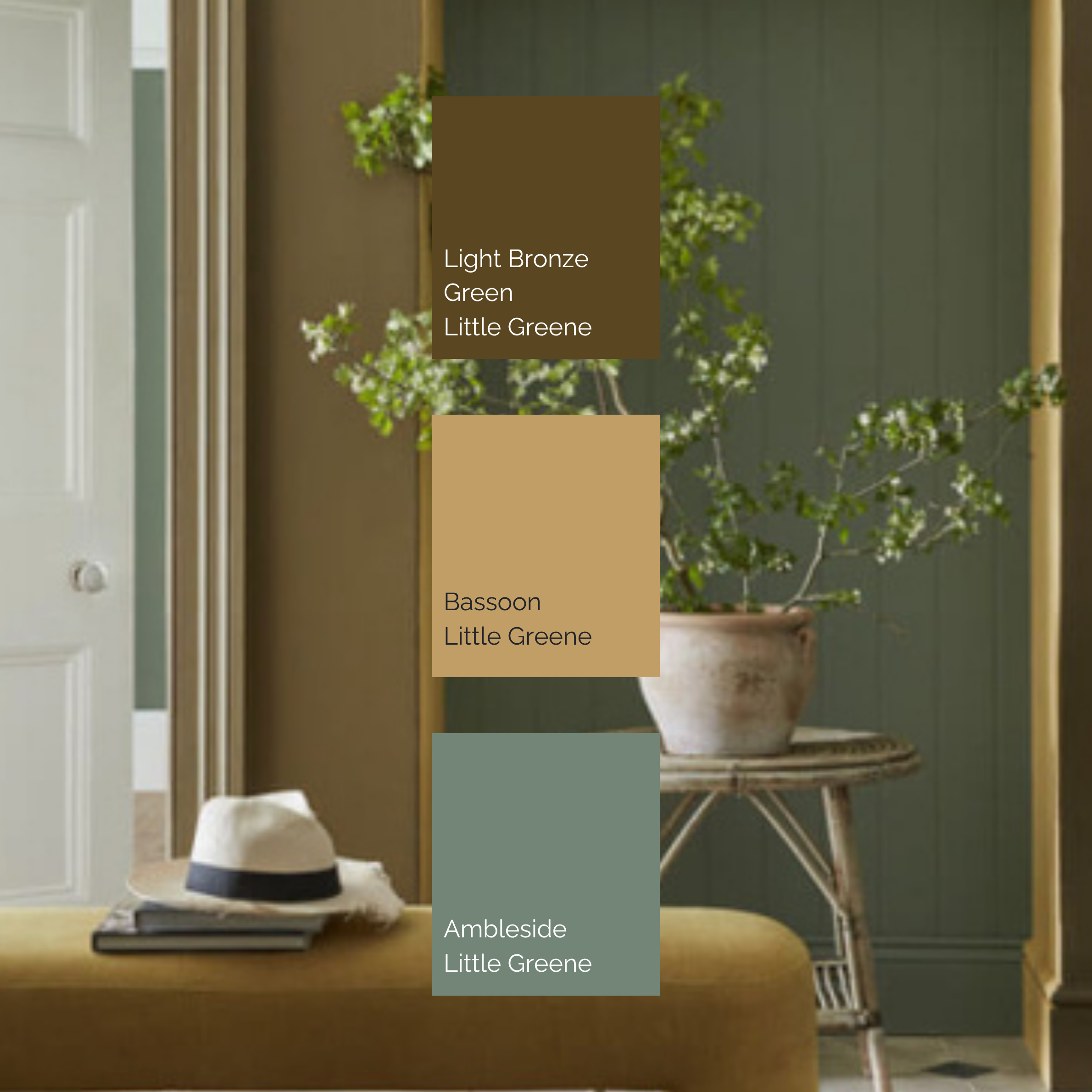
Photo Credit - Little Greene
Olive green, ochre & warm neutrals
Light Bronze Green by Little Greene
Bassoon by Little Greene
Ambleside by Little Greene
Green is often associated with freshness, but the right green can feel wonderfully cosy. The combination of Light Bronze Green, Bassoon and Ambleside creates a more autumnal interpretation of green, earthy, muted and sophisticated. The ochre quality of Bassoon introduces warmth, while Ambleside brings a softer, more natural green into the palette.
This is a beautiful approach for rooms that benefit from a connection to the outdoors, particularly when paired with timber, aged brass, natural stone and tactile fabrics. Rather than thinking of green as a statement colour, consider using several related tones throughout a room. This creates depth without making the scheme feel busy.Farrow & Bal
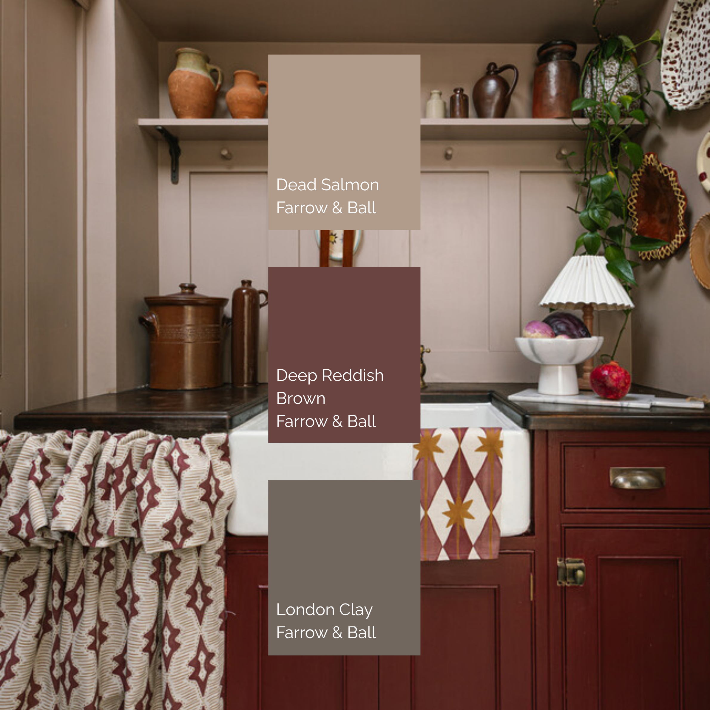
Photo Credit - Farrow & Ball
Dead salmon, deep reddish brown & London clay
Dead Salmon by Farrow & Ball
Deep Reddish Brown by Farrow & Ball
London Clay by Farrow & Ball
This is perhaps one of the richest combinations in the collection.
Dead Salmon has a softness that prevents the scheme from becoming too dark, while Deep Reddish Brown and London Clay introduce warmth and depth. Together, the colours create a feeling that is cocooning without being gloomy.
This is particularly effective in spaces where you want to embrace a little drama, a dining room, library, boot room or intimate sitting room. Using different depths of colour within the same warm family can also make a room feel more considered. Instead of one dominant shade competing for attention, the colours work together to create a layered backdrop.
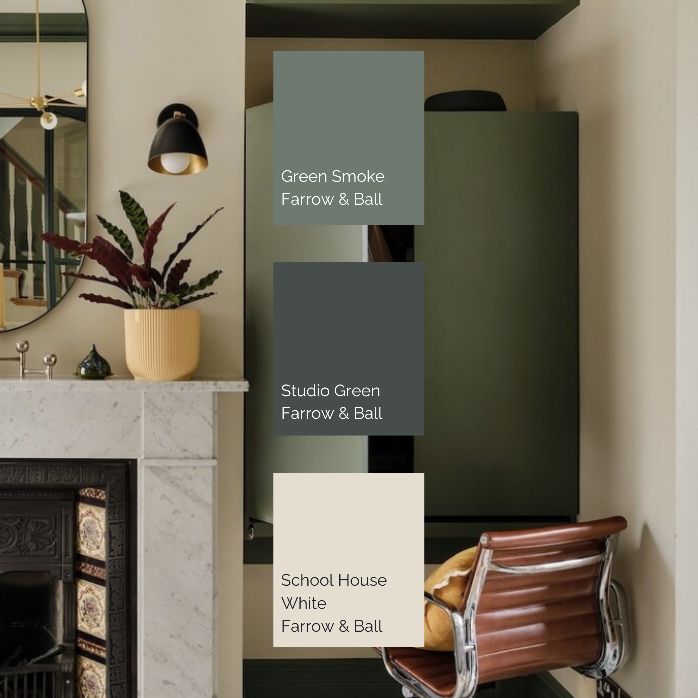
Photo Credit - Little Greene
Green smoke, studio green & school house white
Green Smoke by Farrow & Ball
Studio Green by Farrow & Ball
School House White by Farrow & Ball
For something deeper and more atmospheric, consider combining softened green with an almost-black green and a warm off-white. Green Smoke brings a muted, slightly smoky quality, while Studio Green provides depth and definition. School House White then acts as a softer counterpoint.
The result is dramatic, but not stark. This combination demonstrates why contrast doesn't always need to mean bright versus dark. The contrast can come from temperature, depth and saturation.
In a home with good natural light, deeper greens can feel incredibly elegant. In darker rooms, they can instead create a more intimate, cocooning atmosphere.Little Green
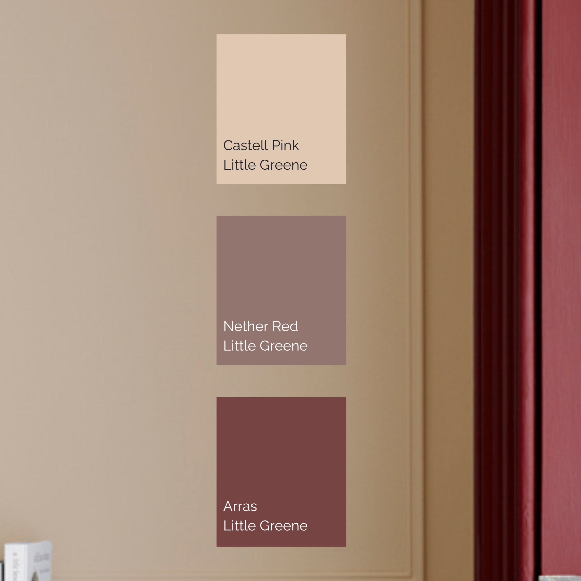
Photo Credit - Little Greene
Soft pink, deep red & earthy brown
Castell Pink by Little Greene
Nether Red by Little Greene
Arras by Little Greene
Pink might not be the first colour that comes to mind when thinking about an autumn interior, but softer, muted pinks can be incredibly effective when combined with deeper, earthier tones.
Castell Pink provides a gentle starting point, while Nether Red introduces a muted depth and Arras brings a richer, more grounded quality. The result feels warm and enveloping without becoming overtly traditional.
This type of palette works particularly well in bedrooms, dressing rooms and sitting rooms, where a sense of softness is often desirable. The secret is to avoid making the pink too sweet. Pairing it with red-brown tones, aged materials and natural textures gives it considerably more depth.today.
Warm neutrals don't have to be boring
One of the easiest ways to create a cosy autumn interior is to reconsider what we mean by neutral. A neutral palette doesn't have to be white, beige and grey. Warm stone, mushroom, taupe, clay and softened pink can all act as neutrals, particularly when they have enough complexity to respond differently throughout the day.
This is where colours such as Slaked Lime, Dead Salmon and Castell Pink become particularly useful. Rather than using one neutral throughout a room, try layering several related tones. A slightly deeper shade on joinery, a softer wall colour and warmer upholstery can create a subtle sense of depth while maintaining an overall feeling of calm.
Let the architecture guide the colour
Colour becomes much more successful when it responds to the room around it. Before choosing a shade, consider the natural light, ceiling height, architectural details and materials already present. A deep colour can emphasise panelling or joinery beautifully. A softer shade can make a small room feel enveloping rather than restricted. A warm neutral can highlight natural stone or timber.
Colour shouldn't exist in isolation.
The most successful schemes consider everything around it, flooring, curtains, upholstery, artwork, metals and even the view beyond the window.
Use colour in layers, not blocks
A cosy interior doesn't necessarily need one dark feature wall. In fact, painting walls, ceilings, doors or joinery in closely related tones can often create a more sophisticated result. Using several shades from the same colour family allows a room to feel enveloping without becoming visually flat.
This is particularly effective with the autumnal palettes in our examples, where browns, reds, greens and warm neutrals can be repeated in different strengths across the room.
The result is subtle, but it makes a difference.
Remember that lighting changes everything
The colour you choose in the morning may not be the colour you experience in the evening. Natural light changes throughout the day, while artificial lighting can significantly alter how warm, cool, deep or muted a shade appears. This is particularly important when working with richer autumnal colours. Always test colours in the room they are intended for and look at them at different times of day.
And don't forget the role of layered lighting.
Wall lights, table lamps, floor lamps and picture lights can bring warmth and depth to a colour scheme once the natural light begins to fade.
